Brand Identity Case Study–Shipping Services
MoveXpress Shipping Services has a mission to continuously provide exemplary customer service experience in the field of Relocations, Moving, Storage, Industrial Packing and Logistics, and Freight Services.
Owner and CEO of MoveXpress – Suku Sudakaran is a Dubai-based expert with many years of experience in the shipping industry. Suku had a vision to create his own business and approached Frank Brands to create a new brand identity.
First off was company naming. We went through my Descriptive, Abstract, and Evocative naming process to explore new memorable brand names with more impact than competitors – finally settling on MoveXpress.
The next stage was translating the new MoveXpress name into a Visual Identity that firmly differentiated the business from the competition.
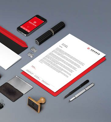
I created the usual three brand concept presentations with 3 Logotype ID paths plus colour palettes and typefaces presented with photo-realistic visuals.
The chosen logo concept shown here was based on multiple arrows to show the movement of goods. The arrows combine to create an X for Xpress. The magic is a ‘hidden’ 2nd large arrow created by the negative space in-between the icon elements which is in turn replicated the double arrow in the logotype typography. Clever! The typography was customised for brand ownership with the ‘X’ creating a double forward arrow to symbolise positive urgency and progressive action. The colour palette was a very bold move and a pleasant surprise as a client choice. This is a bold, vibrant palette that completely differentiates MoveXpress from the more dull and corporate competitors – helping brand recall. The result is a future-proof, iconic, striking, memorable logotype – that successfully differentiates MoveXpress from their competition.
Delivered: Company Naming, Logotype, Colour Palette, Stationary.


No comment