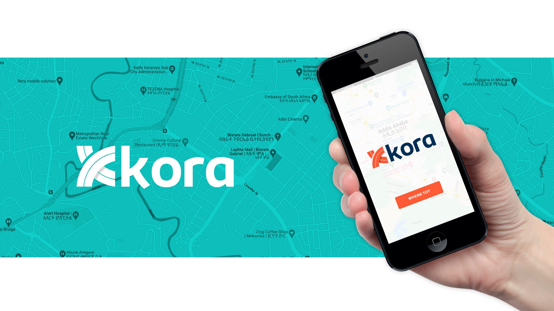
Brand Identity Case Study – Kora Taxi
A brand identity for a new taxi hail ride app Kora. The client is based in Addis Ababa in Ethiopia.
The logo route rationale was an abstract road approach. On the road, travel, driving concept concept. An abstract K icon to achieve brand ownership.
The stylised K icon is created by 2 overlapping roads – dual lane highways. The roads symbolise 4 compass directions of North, South, East and West – the idea that Kora promises to take you any location on the map.
Delivered: Company Logotype, Colour Palette, Stationery, Typeface, Icons, social Media Covers, Swag


No comment